How We Build a Brand Identity
This case study focuses on how the Nancy Burgess Strategic Marketing team created a new brand identity for a regional company, Malik Lighting & Signs, Inc.
The Brand’s Situation: a New Focus
The owners of a local, family-owned business approached Nancy Burgess Strategic Marketing for a combination of search engine optimization services and content creation.
Moreover, the owners recognized the need to differentiate the company in terms of its words and its appearance. We call this rebranding both verbal branding (verbal and written words) and visual (logo, colors, etc.) branding.
Previously, the brand had provided lighting and lighted sign services for a variety of businesses. However, at this point, the owners wanted to begin to target a specific niche.
Along with its traditional services, it would also focus on:
- Replacing gas station price signs,
- Converting gas stations from one name brand to another,
- Installing cooler lighting in convenience stores (C-stores), and
- Other lighting, branding, and sign services related to gas stations.
1. Defining the Brand Identity
To begin, we used our brand identity questions to help the clients:
• Clearly detail their target customer segments
• Identify and differentiate themselves from top competitors (we researched each one in depth)
• Describe their company values
• Shape the brand personality
• Recognize the customers’ pain points and the solutions the company offered
From there, we clearly defined the unique value proposition—what the company offers that the competition does not.

2. The New Verbal Brand Identity: The Company Description
Based on the brand identity, we wrote the following new company description:
“For 25 years, Malik Lighting, Branding & Signs has been providing high-octane services at affordable rates. We offer remarkably speedy 24/7 emergency repairs, upgrades, and new or rebranding installations with maximum efficiency and performance. Fueled by a passion for working with jobbers and gas station owners, you’ll find our upbeat attitude and exceptional service refreshing. We’re honest, proficient, and don’t cut corners on quality or service. We’ll go the extra mile for you.”
Did you notice the following phrases above: high octane, remarkable speed, fueled by passion, and go the extra mile? We were able to write a concise (fewer than 500 characters) description that played on words related to gas stations and travel.
3. Re-Creating the Visual Brand Identity: The Logo Development
Our clients requested a new logo. The existing logo was actually a detailed illustration—not a true logo.
Logo Concepts
Our graphic designer reviewed the brand identity information to begin the creative design process. From there, she created 10 different logo concepts we would present to the client—exceeding the typical expectation of three to five different logo concepts.
Some of these were those the client had prescribed or requested. Additionally, she also created options we believed would further advance and differentiate the brand.
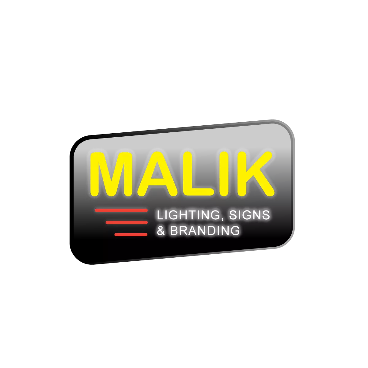
In the next round, we whittled the options down to six different logos. Note the descriptive copy below each logo and how it conveys elements that we believed differentiated the brand.
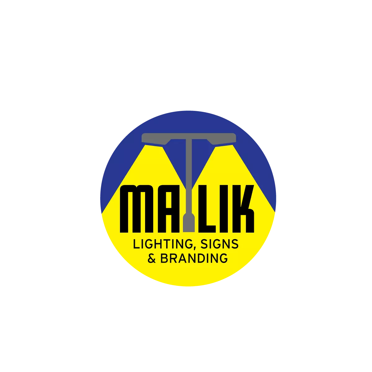
Logo Concept 1
- Client requested this design
- Features post lighting
- Light beams focus on name
Logo Concept 4
- Superhero icon implies 24/7 emergency repair service, remarkable speed, as well as exceptional integrity, service, and passion
- Crescent moon conveys lighting
Logo Concept 2
- Reminiscent of a gas station sign
- Lines and tilt imply speed
- Shows glowing light
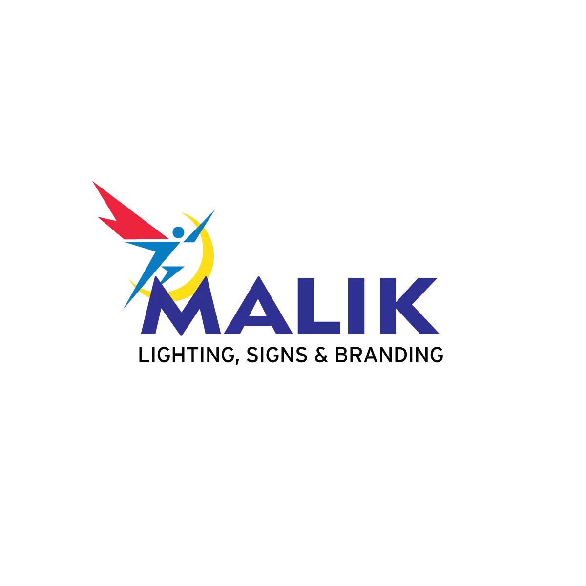
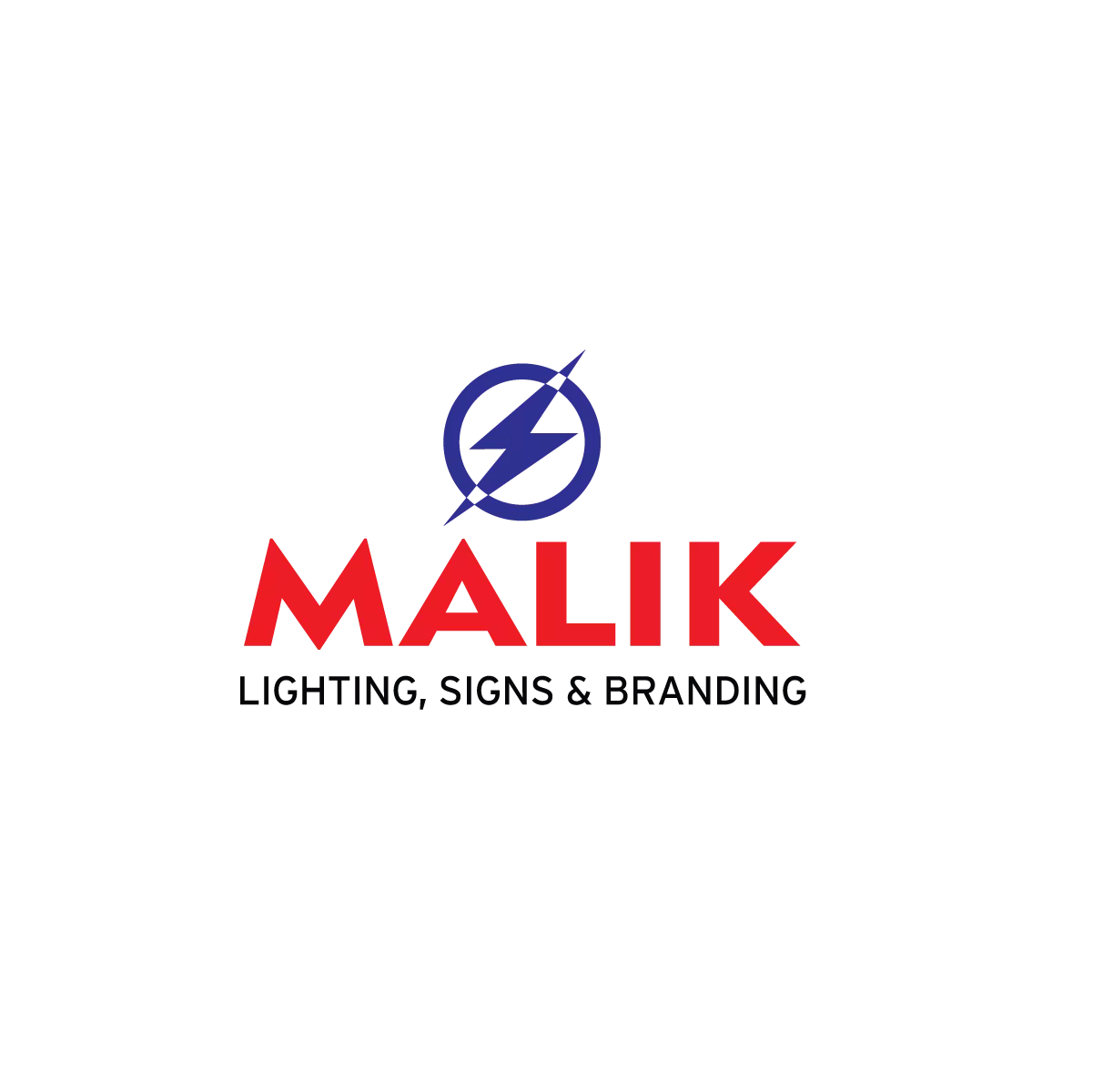
Logo Concept 5
- Lightning bolt connotes electricity
- Icon reminiscent of superhero insignia (conveying features of logo concept 4) and high-octane service
- Indicates maximum efficiency and performance
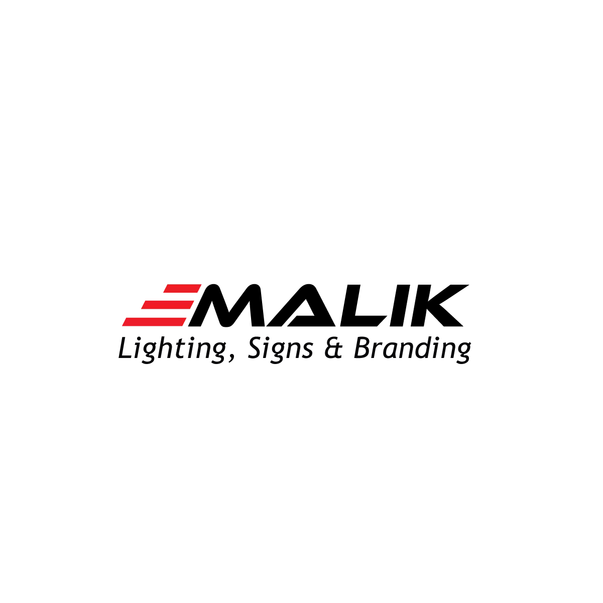
Logo Concept 3
- Lines connote three owners
- Font conveys remarkable speed
- Shows movement similar to a car
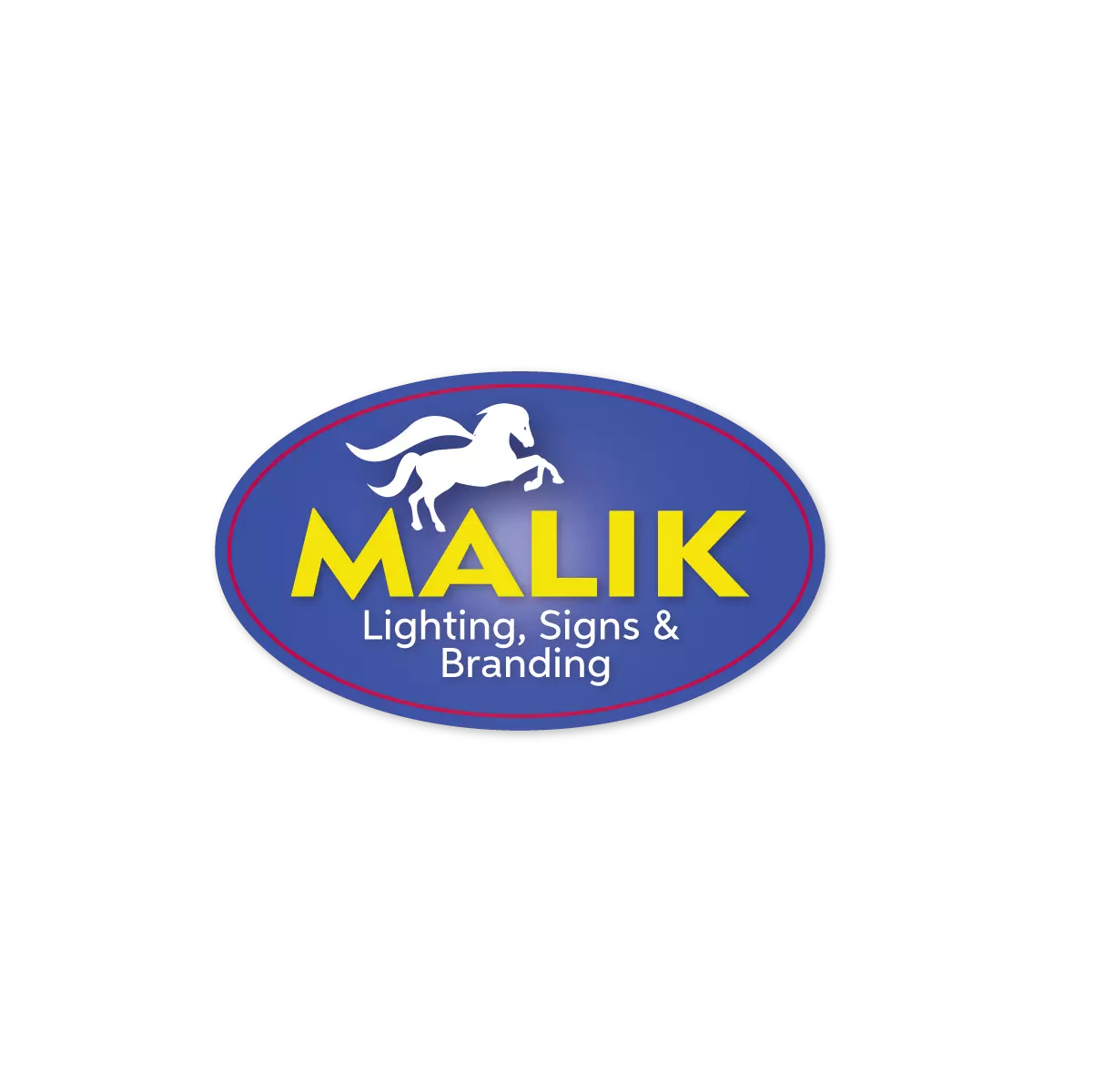
Logo Concept 6
- Reminiscent of a gas station sign
- Implies exceptional high-octane service and horsepower
- Indicates 24/7 emergency repairs,
- Reflects lighting and performance, fueled by passion
Final Chosen Brand Logo and Brand Icon for Identity
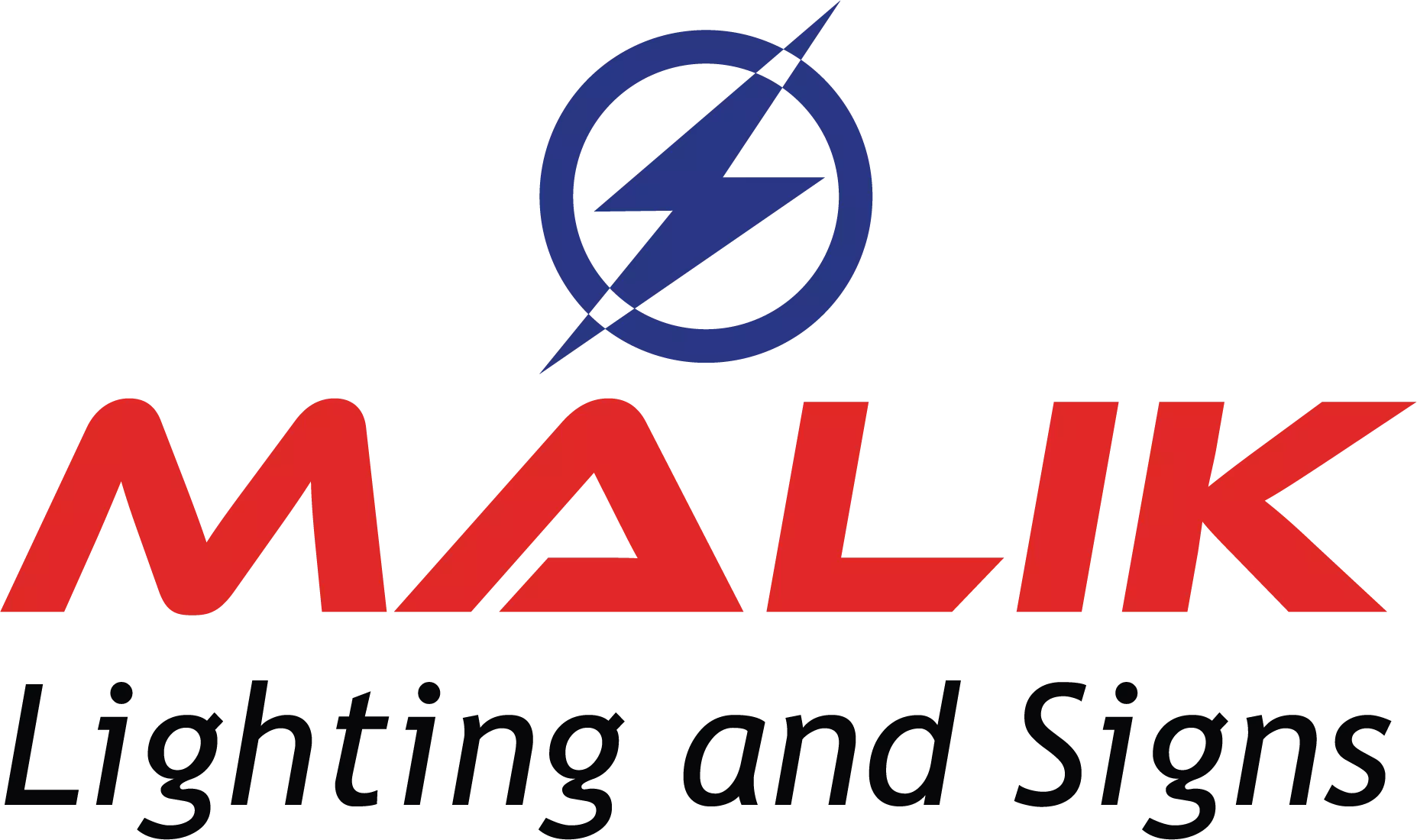
In the end, we combined the font from logo concept 3 with the icon and colors from logo concept 5.
The final logo conveyed the following brand criteria:
- High-octane, electrical service
- Remarkable speed and movement fueled by passion
- Maximum efficiency, performance, and integrity (like a superhero)
Final Logo and Relevant Files
Once the new brand logo was approved, our graphic designer created the following:
- Logo spec sheet: specifications that identify the color numbers for Pantone (PMS), Processs (CMYK), RGB, and hexidecimal (HTML); and under what circumstances to use each type of file
- Logos in multiple formats including:
- CMYK .eps for four-color processing;
- PMS .eps for spot color, PMS printing;
- RGB .png for websites, PowerPoints, Word documents, and/or where a transparent background is needed;
- RGB .jpg for websites, PowerPoints, Word documents, and/or where a white background is suitable.
- Favicon or icon in a .png format for use as a favicon on websites or as an icon on social media accounts
Summation
This case study is typical of the brand identity work we have done for many, many clients. Some need an entirely new logo. Others need a refreshed logo. Still others just need a brand icon. See our small business branding and brand identity services.
Time to Create, Re-create, or Refresh your Brand?
Nancy Burgess

