Logo Designs and Brand Messages
A brand is so much more than its logo, icon, fonts, colors, and name. Excellent logos, brand names, and messages help to tell the brand’s story. Check out our work.
Logo Designs and Brand Messages We’ve Created
Define or reflect the brand’s essence
Visual and verbal identity
Memorable
Creative formats for different uses
Logo Designs, Brand Messages, and Their Back Stories
Notice the variety of the logos that our Art Director and Graphic Designer Christine McCurdy has created for us. Only when we create a brand extension, a family of logos, does one resemble another. For each logo, the font(s), colors, and icons form a cohesive unit with a unique brand message.
Each brand has its own story. So does each logo. Toggle the plus sign to learn more about the creation of that logo, its name, its characteristics, and more.
Fresh, Organic, Modern
The owner of EDEN Gardens & Farms came to us with her new business idea. She would need a name for her organic micro-farm and vacation rental. We presented naming and branding options. She chose EDEN Gardens & Farms.
The brightly colored cherry tomatoes of her logo reflect the organic growth and the variety of unique vegetables she harvests. It also makes a great standalone icon on social media.
We hired a professional photographer, provided art direction for the photos, and built her website–everything the owner needed for a successful business brand.
A Brand Extension
In addition to her farm, the client would be selling her organic produce. For this brand extension, we created the “Harvest to Home” name and logo. This was designed to be used on bags and boxes that could transport the organic produce.
Fast, Super Hero Action
The owners of Malik Lighting & Signs came to us to enhance the company’s search engine optimization. But the brand also needed a logo. The company was using a complete illustration of a gas station as its logo. See how we approached the process in this Brand Identity Case Study.
Guiding the Way
The owner of this company, Nancy Hedlund, was one of our first clients. She was launching her consultancy that would help pharmaceutical and healthcare companies make data-based decisions.
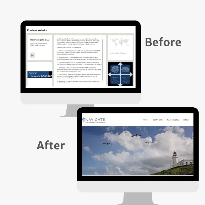
MedNavigate had a draft logo that used the rose compass and a draft website.
We built the consultancy a new website (our first client website). We also helped her with her tagline.
See the “before” logos and website.
Ecommerce Launch
A technology company partner asked us to write content and optimize this client’s new ecommerce website.
Although the company had been in business since the 1960s, it was new to ecommerce and never had a true, professional logo.
We presented various options. The client wanted a blue logo (commonly used in healthcare). We chose a distinctive shade of blue to help differentiate it from other healthcare brands, which tend to use a shade somewhere between royal blue and dark navy.
We also wanted a modern-looking, futuristic font to reflect the company’s move toward ecommerce and the future. Since the company name doesn’t reflect what the company does, we used the tagline to better explain it.
Overdue Upgrade
This company was using a text-based logo that was not designed by a graphic designer. For example, the leading (pronounced LED-eeng) or vertical space between the lines of text, was overly large, the font choice was generic, and its duotone use of color was “off.”
Furthermore, the logo had no icon for social media or to better reflect what the brand was about (a CPA firm that also focused on environmental sustainability).
Layers of Meaning
What a great name! Another web designer referred us to this client, a pediatric occupational therapist with a unique approach to helping children. As we worked on the client’s content and search engine optimization, it was clear that they could use a logo refresh to reflect the professionalism of the brand.
The company’s name was ideal. It reflected both the ability of children to go beyond expectations and also was a childhood favorite of the owner and her special needs brother.
We used the infinity symbol and the rocket to highlight the unlimited potential of children and the company. The client liked the color progression from the previous logo, so we also incorporated it.
Logo Tells the Story
Our client was launching a business with a novel concept. He had purchased the equipment to take 3D images that would be printed in sandstone.
He already had chosen a name: My 3-D Mini Me. We wrote the tagline “Hold onto the moment.” We felt the logo shown here best reflected his brand.
Read the launch case study and see Nancy holding her third granddaughter as a MiniMe.
Clarifying a Name
Cheryl Barratt originally came to us for a logo and website for her consultancy of the same name. We determined that what she did (consulting with surgery centers) was so rare that it needed to be in her tagline: Perioperative Consulting.
We also differentiated her with the message: “The Barratt Merit.” It encompassed three characteristics her company offered that competitors did not.
Later, she changed the company name to Perioptimal Performance Partners.
Read the branding case study.
Nobody’s Perfect
This psychological counseling team came to us after hearing Nancy Burgess speak about search engine optimization (SEO) at the local library. The counseling center needed a brand refresh.
The “imperfect circle” that forms the “O” highlights the fact that no one is perfect and that even with counseling the circle never closes. And that’s okay.
We also oversaw and scripted the video shoot, planned the photo shoot, and chose all the imagery for the website. Of course, we wrote the search engine-optimized copy
Growing Client’s Brands
We started out as many small businesses do—without a logo. We’re a little embarrassed to tell you that we were using a web template that had a stock photo of a daisy at the top. (Yikes!)
Nancy wasn’t sure if the website would be a portfolio to find a job or the launch of the business. That’s why the domain name matches hers.
By the time that we decided it was indeed! a business, it was time to ask Christine for a logo.
The lotus-like “Dyna-bloom” that is our icon symbolizes dynamic growth for our clients.
The three petals represent 1) traditional branding and print communications; 2) today’s internet, website, and digital communications; 3) artificial intelligence (AI) and the future. The future is now.
Brand Extension
After one of our semiannual strategy sessions with our client, we determined that we wanted to put an additional spotlight on our client’s ability to manufacture corrugated shipping boxes for ecommerce.
We called it WEcommerce in keeping with the “WE” messages and images we’ve incorporated into the manufacturer’s website.
Read the story of the website launch.
Logo Refreshes
These logos existed. They simply needed a little refreshing to make them ideal.
Integration
The owner of this company had a canned logo that looked much like this one. We refreshed it with some color, her credentials, and her specialty to give the logo that je ne sais quoi.
But What Do They DO?
The photographer owner of this business liked her company name. But the existing logo text was so small that it was totally illegible. We refreshed her logo to clarify what Blue Fire Hydrant did—and to ensure that the name on the logo was legible.
Social Media Campaign
A Realtor and a mortgage lender combined their talents to host a webinar for first-time home buyers.
Neither was allowed to use its brand name in the campaign. Therefore, we created a quick logo with an inspirational and aspirational “Dreams Can Come True.” The outline of the house helped to clarify the meaning of the “dream”: home ownership.
